How to make an accordion with React Native
In the journey of making complex animations with React Native, let’s make an accordion!

I don’t know what is the best term for this component. I call it accordion, others call it expandable list. In the first version of material design this component was called as “Expansion Panel”. In the latest version they simply don’t talk about it anymore. In Apple’s Human Interface Guidelines they named it as “Disclosure controls” and in SwiftUI for some reasons they called it DisclosureGroup. But the documentation writer described the component as:
A view that shows or hides another content view, based on the state of a disclosure control.
Yes that is exactly what I mean.
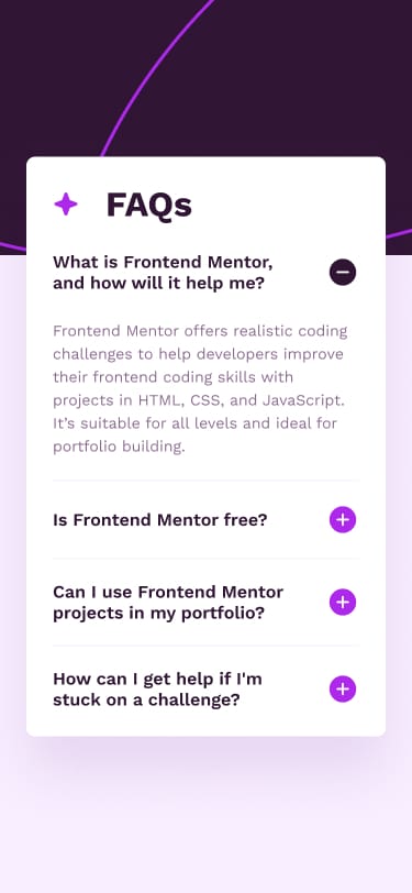
I’m going to use the assets from the frontendmentor challenge because it looks nice.
Setup
To begin, inspired by Android I dumped all the data under one true global variable called R
const R = {
  colors: {
    white: "hsl(0, 0%, 100%)",
    lightPink: "hsl(275, 100%, 97%)",
    grayishPurple: "hsl(292, 16%, 49%)",
    darkPurple: "hsl(292, 42%, 14%)",
  },
  images: {
    background: require("./assets/images/background-pattern.png"),
    iconStar: require("./assets/images/icon-star.png"),
    iconPlus: require("./assets/images/icon-plus.png"),
    iconMinus: require("./assets/images/icon-minus.png"),
  },
  fonts: {
    regular: {
      name: "WorkSans-Regular",
      weight: 400,
    },
    semibold: {
      name: "WorkSans-SemiBold",
      weight: 600,
    },
    bold: {
      name: "WorkSans-Bold",
      weight: 700,
    },
  },
  strings: {
    header: "FAQs",
    content: [
      {
        title: "What is Frontend Mentor, and how will it help me?",
        body: "Frontend Mentor offers realistic coding challenges to help developers improve their frontend coding skills with projects in HTML, CSS, and JavaScript. It's suitable for all levels and ideal for portfolio building.",
      },
      {
        title: "Is Frontend Mentor free?",
        body: "Yes, Frontend Mentor offers both free and premium coding challenges, with the free option providing access to a range of projects suitable for all skill levels.",
      },
      {
        title: "Can I use Frontend Mentor projects in my portfolio?",
        body: "Yes, you can use projects completed on Frontend Mentor in your portfolio. It's an excellent way to showcase your skills to potential employers!",
      },
      {
        title: "How can I get help if I'm stuck on a challenge?",
        body: "The best place to get help is inside Frontend Mentor's Discord community. There's a help channel where you can ask questions and seek support from other community members.",
      },
    ],
  },
};
Layout
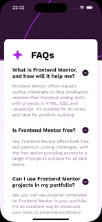
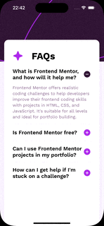
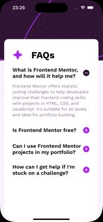
The first step of making an accordion is to make a simple list with all elements all expanded out. Which in code looks something like:
export default function App() {
  return (
    <View style={styles.container}>
      <StatusBar style="light" />
      <Image style={styles.backgroundImage} source={R.images.background} />
      <View style={styles.scrollContainer}>
        <ScrollView
          style={styles.scrollView}
          showsVerticalScrollIndicator={false}
        >
          <View style={styles.contentHeader}>
            <Image source={R.images.iconStar} />
            <Text style={styles.contentHeaderTitle}>{R.strings.header}</Text>
          </View>
          {R.strings.content.map(({ title, body }, index) => {
            return (
              <View
                key={title}
                style={[
                  styles.cell,
                  {
                    borderBottomWidth:
                      index === R.strings.content.length - 1 ? 0 : 1,
                  },
                ]}
              >
                <Pressable style={styles.cellHeader}>
                  <Text style={styles.cellTitle}>{title}</Text>
                  <Image style={styles.cellIcon} source={R.images.iconMinus} />
                </Pressable>
                <Text style={styles.cellBody}>{body}</Text>
              </View>
            );
          })}
        </ScrollView>
      </View>
    </View>
  );
}

const styles = StyleSheet.create({
  container: {
    flex: 1,
    backgroundColor: R.colors.lightPink,
  },
  backgroundImage: {
    width: "100%",
    resizeMode: "cover",
  },
  scrollContainer: {
    position: "absolute",
    backgroundColor: R.colors.white,
    borderRadius: 16,
    width: Dimensions.get("window").width - 32,
    height: Dimensions.get("window").height - 150,
    top: 150,
    left: 16,
    right: 16,
    padding: 32,
  },
  scrollView: {
    backgroundColor: "transparent",
  },
  contentHeader: {
    flexDirection: "row",
    gap: 32,
    paddingVertical: 8,
  },
  contentHeaderTitle: {
    fontSize: 36,
    fontFamily: R.fonts.bold.name,
    fontWeight: R.fonts.bold.weight,
  },
  cell: {
    paddingVertical: 16,
    borderBottomColor: R.colors.lightPink,
  },
  cellHeader: {
    flexDirection: "row",
    alignItems: "center",
    justifyContent: "space-between",
  },
  cellTitle: {
    fontSize: 20,
    fontFamily: R.fonts.semibold.name,
    fontWeight: R.fonts.semibold.weight,
    width: "90%",
  },
  cellBody: {
    fontSize: 16,
    fontFamily: R.fonts.regular.name,
    lineHeight: 22,
    color: R.colors.grayishPurple,
    paddingTop: 16,
  },
});
The interesting bits are with creating a z-stack layout, with an image view in the background and a scroll view in front.
The tricky thing with ScrollView is that it needs a fixed frame and flexible content size. And what this actually means in ReactNative is that the parent of ScrollView should have a fixed size and then the children can be whatever.
But the container view also needs a position: absolute so we can move it in front of the image. And this bit of css does exactly all of that:
  scrollContainer: {
    position: "absolute",
    width: Dimensions.get("window").width - 32,
    height: Dimensions.get("window").height - 150,
    top: 150,
    left: 16,
    right: 16,
    // ...
  }
If you’re coming from a UIKit background like me and if you squint your eyes a bit this math looks like what you need to do for CGRect.
And with our basic setup is done
State management
Next step in making an accordion is to handle the state. And by state I mean either the selected index or an array of indices.
In code this means to first introduce useState and then using the Pressable to update the state. And finally the UI to consume the state.
export default function App() {
  const [selectedIndex, setSelectedIndex] = useState(0);
  // ...
    <Pressable
      style={styles.cellHeader}
      onPress={() => setSelectedIndex(index)}
    >
      <Text style={styles.cellTitle}>{title}</Text>
      <Image
        style={styles.cellIcon}
        source={
          selectedIndex === index
            ? R.images.iconMinus
            : R.images.iconPlus
        }
      />
    </Pressable>
    {selectedIndex === index && (
      <Text style={styles.cellBody}>{body}</Text>
    )}
  // ...
}
Animate changes
And the final step is to animate the changes. In ReactNative that means using Reanimated to animate the height.
function Cell({ text, isOpen }) {
  const cellContainerStyle = useAnimatedStyle(() => {
    const height = isOpen ? withTiming(100) : withTiming(0);
    return { height };
  });
  return (
    <Animated.View style={cellContainerStyle}>
      <Text style={styles.cellBody}>{text}</Text>
    </Animated.View>
  );
}

<Cell
  text={body}
  isOpen={index === selectedIndex} />
Now to calculate the actual expanded height, we need to first calculate the max height of the Cell by wrapping the text within a View with position: absolute and using the onLayout callback to record the evaluated height.
Then, we need to make sure the Animated.View has overflow: hidden to clip the content from being rendered outside of the box.
function Cell({ text, isOpen }) {
  const [maxHeight, setMaxHeight] = useState(0);
  const cellContainerStyle = useAnimatedStyle(() => {
    const height = isOpen ? withTiming(maxHeight) : withTiming(0);
    return { height };
  });
  return (
    <Animated.View style={[
      cellContainerStyle,
      { overflow: "hidden" }
      ]}>
      <View
        style={
          { position: "absolute" }
        }
        onLayout={(e) => {
          if (maxHeight === 0) {
            setMaxHeight(e.nativeEvent.layout.height);
          }
        }}
      >
        <Text style={styles.cellBody}>{text}</Text>
      </View>
    </Animated.View>
  );
}
And this is how you build an accordion with ReactNative.
The code from this experiment is available on https://github.com/chunkyguy/frontendmentor